Sequential Practice
Sophia Mylan
Week 1 - Line


For the first week of term we had to focus on line - Going out to Kings Parade, Bene't Street etc, to make these observational drawings was make us try and record the feeling, scale and space of the area as well as the people in it. The aims of this lesson was to be confident in our lines, to make a steady/energetic line or a continues/implied line. The exercise at the beginning of this lesson also showed that is is important to look at the subject you are drawing more than your page. The materials I decided to use for this were graphite pencils and a brush pen, the pen allowed me to think about line weight and how it can imply depth.
week 2 - Perspective and Composition


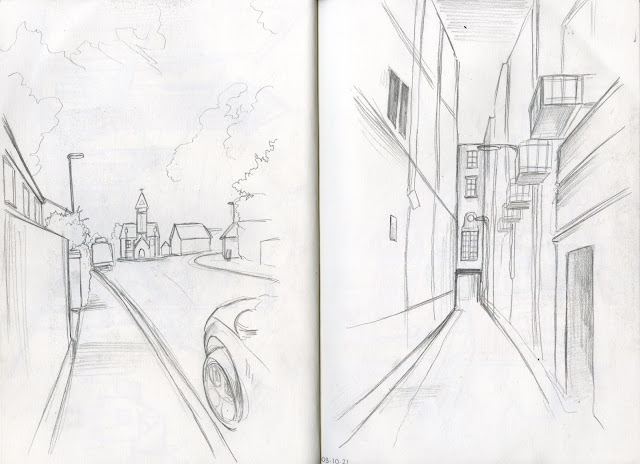

The aim of this weeks lesson was to focus on perspective/composition in settings, so these drawings mainly features buildings or scenes from whole streets (Being home during this lesson meant I wasn't able to use the buildings of Cambridge for reference) - These are again focused more on line, and I also decided to use blue and red pencils in the last two drawings as well as graphite pencils and the same brush pen. Many of these observational drawings feature the street in my village are drawn at eye level, but the drawing of my room was done at a high point of view and the last drawing was done as a low point of view.
Week 3 - Tone
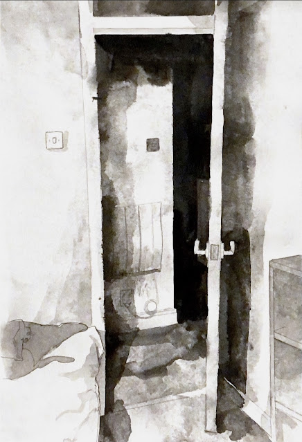


As we have been focusing on line for the past lessons it is now time to star incorporating tone into my drawings - Tone is a very useful method of capturing lighting an atmosphere. Mainly using the media charcoal and ink as well as grey-scale scraps of paper I made some pieces with the use of tone in mind, so I chose more dramatic lighting in the scenes I chose to draw. The piece including the statue doesn't have the largest tonal range but I believe I was successful when looking at the drawings of the door frame and the trees.
Week 4 - Tone to Colour


Furthering our use of tone, this weeks lessons looks into tone to colour. It showed that there is a variety of tones in any colour and it helped in my understanding of hues tone and complementary colours/palettes. Using simple complementary colour palettes of green and red, orange and blue etc. emphasised the shifts in tone as using these palettes are really effective in emphasizing areas in your drawing, for exaple, yellow stands out much greater when surrounded by purple. We went to the Fitzwilliam museum but I later went to the Zoology museum of Cambridge to create more drawings.
Week 5 - Observation to imagination: Research


As we were set a project this lessons objective was to create 3 spreads of thumbnails in preparation for our sequential drawing assignment. The location for these thumbnails were the River Cam but many of them also include the railway from Peterborough to Cambridge as well as my village etc. - the point of these thumbnails is to help plot the essential subject of the subject to later upscale it.
Life Drawing session 1: Line


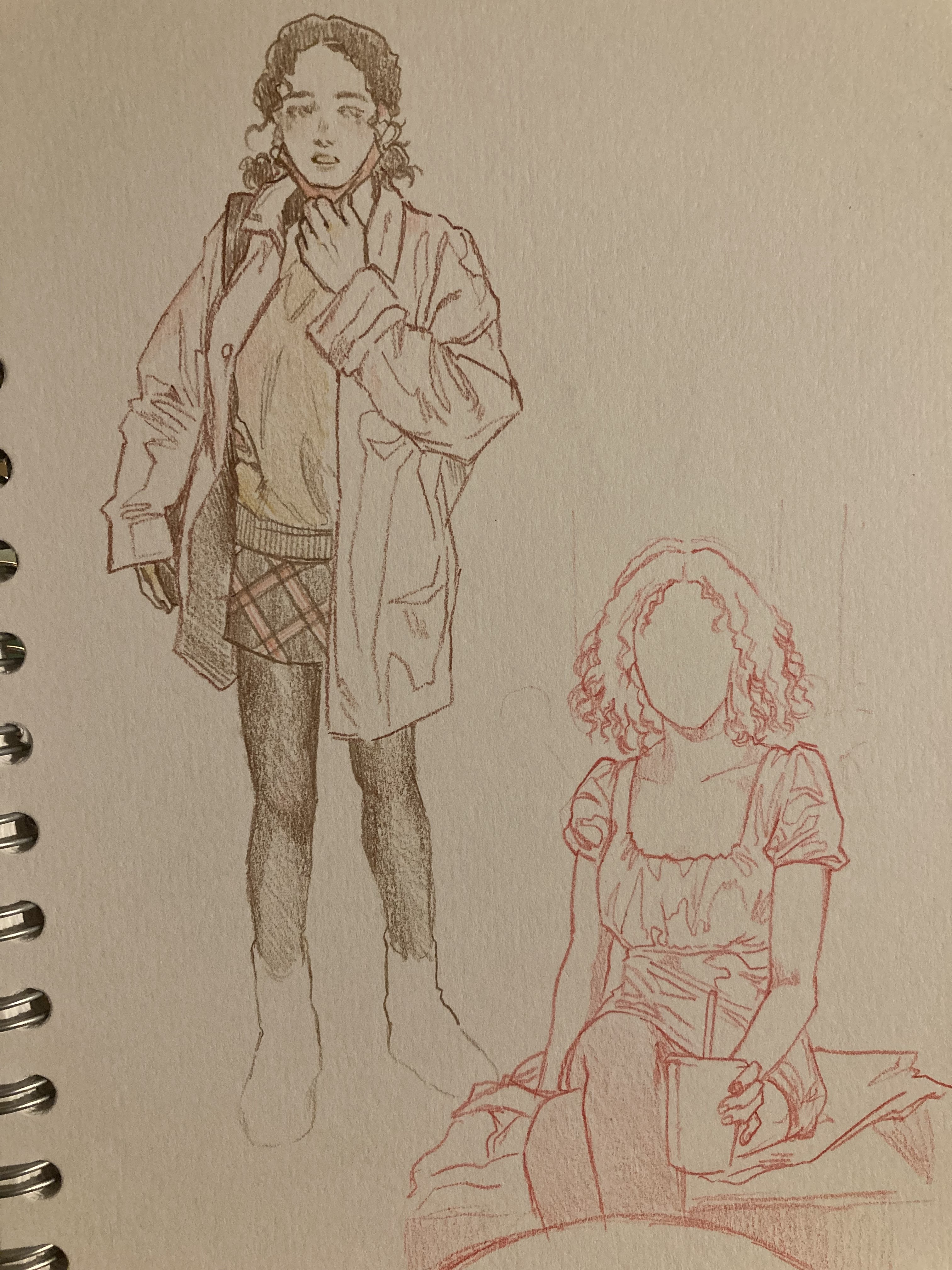
This was the first life drawing session I had at Anglia Ruskin, and although I have attended other life drawing classes I found this to be the most enjoyable one - The aim of this session was to use line, and I feel as if it really helped, it reimbursed the idea that you should look at the subject more than your own drawing. It also showed the impact of size as working at a much larger scale helped me makle more confident and expressive lines.


This exercise again focused on looking more at the subject than at your page, but also feeds into the assignment/sequential drawings as both require memory and imagination - these can be seen in how the first exercise was to draw blind.
Additional Life Drawing:


Week 6 - Observation to imagination: Sequence


For the sequential drawing assignment I chose to draw a different location to the River Cam - I instead chose to draw the sequence of a walk I went on. As this was based on observation to imagination I decided that I wanted to portray the idea of time passing through a sunset. This also led to my decision to use a limited colour scheme of red and green over a monochrome or greyscale palette. The passage of time in my sequence is rather slow and I could have developed it further by adding a few extra panels, shwing the transition of sunset to night time, but i am happy with the outcome.
Life Drawing Session 2: Tone


This life drawing session focused on tone - As the life drawing session prior focused on line this was an opportunity to apply tone since there were longer poses. This lesson was helpful in showing the depth that can be created with tone and it also encouraged me to use charcoal more.
Week 7 - Colour theory


This session furthered my understanding of colour theory - I mainly just looked at making a colour wheel and made a series of palettes such as secondary, tertiary, complementary etc.
Week 7 and 8 - Colour theory: Conceptual Illustration


For this assignment of illustrating a book cover, my book of choice was 'The Sea, the Sea' by Iris Murdoc (I was originally going to choose Pride and Prejudice and had already started making the final product but switched to another book midway). For this assignment I again chose to use a two-colour complementary palette of orange and blue, since the blue works well for the theme of the sea. Although the tone of the book is rather dark I wanted the contrast of the vibrancy of the colours I used and the image of supposedly a man drowning to pull in the viewer.


For the final life drawing session the objective was to portray movement through our drawings - starting off with simple poses we worked throughout the session to gradually integrate movement into the drawings. Towards the end of the session we began to overlap our drawings to show a sequence of poses that shows the movement of the model as there was one focal point of the pose where you could linkback to as the root pose. But the final piece also incorporated perspective into the session, the model walked back and forth so it was a hard task but I managed to capture the movement of the model walking in various poses.


Focusing on mark-making, using some of the observational drawings I implemented different types of mark-making. Using a variety of materials in combination with ink I experimented with the different marks they could make (using materials such as forks, rags, stick, string etc. all showed the different effects I could get and how they could imply texture, for example the shaggy hair of the man in the barber shop before he got his haircut).


Week 9-12 - A small gesture
Going out to Mill Road, we aimed to find ideas for the assignment of a small gesture - Visiting shops helped in making observational studies of people in their everyday lives. It was also to gather drawings of people in motion such as people walking in the street etc. this research is going into the concertina assignment.

For the final product of the concertina I decided to combine two actions - The primary action of two people having a conversation and the secondary action of a woman walking past the window of the shop on the street. I was originally just going to focus on just the woman walking, but the requirement of the assignment was to have a fixed view so I decided to move her to the background. As I had been working with the standard 'forest green' and 'cadmium red' I wanted to change it slightly and use a slightly different colour palette of a warmer, rosy red and a minty, viridian green.
Puppet Project - 


The 'Locals' Project -


In preparation of the puppet project over the Christmas holiday we did some life drawings of our person of choice. I chose one of my good friends Orla, the assignment stated it had to be someone well known in the local area and I think almost the whole of Stansted and Bishop Stortford know who Orla is. She's always at the pub or on a night out, there have been times she doesn’t even recognize the people who know her.


As for the maquette I started off with a drawn design. I wanted to go with something simple, so I went with a bed room, with a green and pink colour scheme. I planned to use fabric as the wall paper and the furniture to be made out of clay


After i finished the set design I made the final character design, ready to translate it into a puppet.


The final physical set turned out slightly different to the drawn plan, i chose a checkered fabric and embroidered lace for the carpet and tapestry.


I tried some different lighting for the set, I used a sunset lamp for the warm lighting, I tried to get some dramatic shadows using it. The other lighting was a simple cold light from a lamp.
The final result of the puppet and set resulted in the 30 second video above.
Zine Project -


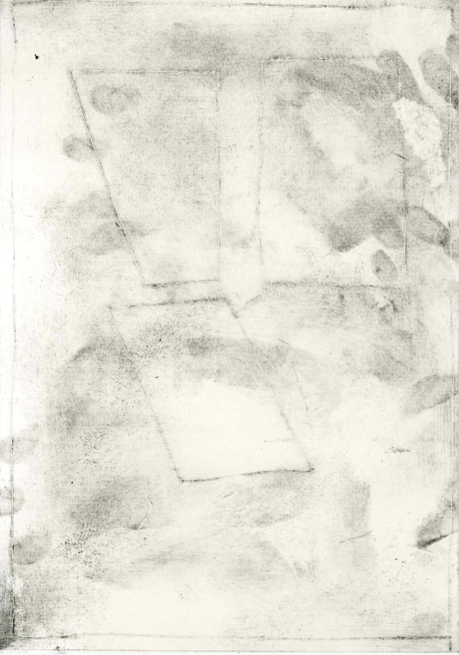


The zine project involved print work. In some of my prints I tried etching out and did some simple printing using plants, leaf's and flowers, by placing paper over the top of them and using a roller with ink to make the print. In my own time I attempted suminagashi, a water marbling technique, I cant say I was very successful but I still ended up using these prints.


I created 15 pages of art for this zine. I scanned and imported my prints and drew over them digitally, I used a lot of the prints as backgrounds and to fill in clothing/figures. In the process of making this zine I tried to take into account the sequence id make, I wanted the pages kind of be two stories, Ieva's side on the left, and mine on the right, I knew I wanted the zine to conclude on a double spread of the two sides coming together. The story itself is a basic one, it focuses on my friend Ieva and me now that we are in university and are apart more often now, as well as how different we are.
Cel Animation -
For this project I decided to animate a dog yawning and stretching, with an actual dog bed as the background. This method of animation meant that what I drew would be mirrored once I started the stop motion process. In the end i think it turned out fine, thee are some consistency errors but as a whole im pleased with the outcome
Collage Animation -
Since this was a group project I was in charge of the camera whilst Libby and Madi took initiative in moving all of the pieces. Before we started the stop motion process we all discussed how the animation would go, we each made our own pieces of the scene, I made the girl and cut out some of the leaf's.
This is another group animation, me and Libby took initiative in this group and did most of the camera work and directing. Before we stated filming we found an isolated location and discussed with everyone our ideas for the animation. We ended up using an umbrella as the main prop, it included a lot of different locations but the camera position remained the same majority of the time. I animated the title card and the credits.

Comments
Post a Comment