Computer Generated Imagery
Motion Graphic Project -

Research -

My book of choice was 'In Praise of Shadows' by Jun'ichiro Tanizaki - I did take the time to read the book so I felt secure in terms of what aesthetic the trailer would be. Gathering images into a mind map helped visualise what elements would fit in the trailer such as traditional Japanese houses with light leaking in; the exposed nape of a woman, lanterns in the dark and many more. The book seemed to show example after example of the differences between the past and present as well as the East and West, with the world forgetting its roots and becoming more westernised because of technology.

I did take an interest in traditional Japanese women's fashion and hostel culture but ultimately had to pull myself away from focusing on that aspect of the book too much since it isn't the main focus/message Junichiro was trying to convey.
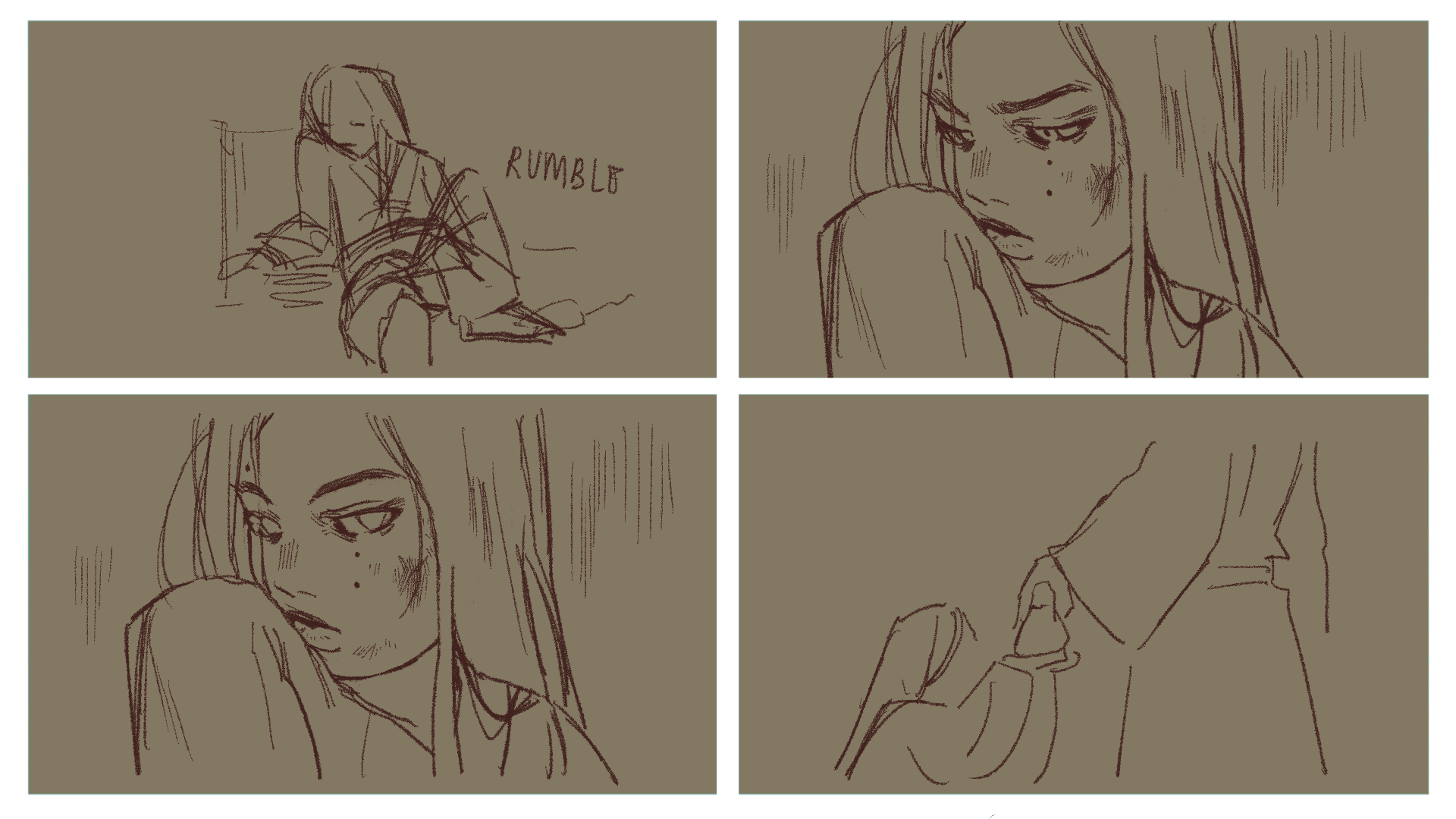
Storyboard -


For my storyboard I had an idea of showing the differences between the traditional/modern world. Originally i wanted there to be harsh cuts between the images to show how much things had changed over time, but I needed to think more about the transitions between images in order to utilise the software.
Animatic -
In this animatic I really wanted the first sequence in grey scale to be serene and aesthetically pleasing to look at. I kept only the start and end of the trailer in grey scale, so that the contrast between black and white in the middle section would have more effect. I did contemplate using a red as an accent colour since I had seen it used in a lot of the books promotions art but decided against, because I didn’t feel as if it would serve any purpose or that I had anything that needed extra emphasis.
Final Animation -
Video link - https://youtu.be/OWEEM4AtXLI
In the final animation I used to use my illustrations instead of images since it felt like I could create what I visioned much easier. Although I originally wanted sharp cuts between images, in the final version the transitions start off simple/gentle, but towards the end of the sequence I kind of wanted to make it seem like a struggle between the two sides, but in the end it returns to grayscale - I wanted to leave the ending of the trailer subjective, since I think there are many ways you can interpreted the book, it seemed that by the end the traditional side of Japan is being forgotten and elders are living in a modern world unsuited for them, but in showing the elderly grandma standing beside the young girl that times cants be t he same forever. But I mainly tried to focus on how the author of the book kept making comparisons of the two sides it is a trailer after all so the ending is ambiguous for the sake of the viewer.
Maya 3D Project -

For this project we were tasked with creating a room/scene in 3D on maya. For the concept of the room I wanted to create I was interested in the boho aesthetic, very rustic but cozy looking rooms with lots of green, oranges and browns. I also wanted to include a slight academia element through books since I wanted to include stacks of books to fill in space on the floor and shelves.
Concept Art-


The concept art I made for the room was to give me a clear layout, where I'd put specific pieces of furniture and it was helpful in showing how much blank space I'd have to fill in like the floor and walls, since I didn't want it to look too plain because I wanted it to look slightly cluttered.
Rendered Images -

%20%20ROOM%20VIDEO_0001%20(1).png)


In the final renders I chose to have it dimly lit, I wanted it to look like the lamp was the light source, so the two lamps had a yellow/warm light and I added some ambient blue/purple light low to the ground of the scene. During the process of making this scene I used the concept art as more of a guideline, so I added more objects than I planned, such as the plates, lamps, pencils, mugs and hanging stars etc. I did have to make some sacrifices in the end, I didn’t include the fairy light, changed the design of the curtains to blinds and decreased the amount of pillows and blankets. As for the pictures on the wall, I wanted to use band posters and botanical posters, I also included small polaroid pictures, I wanted to make the room look ‘lived in’.
Turntable Video -
As for the turntable video, the process of rendering was difficult - My scene was originally too high poly so I had to make more divisions in my models that had too many polygons, and the duvet model was causing the program to crash, but eventually I managed to get the video of the scene. I kept the background of the scene dark since I wanted it to be set late at night.
Interactive Novel Project -
For this project we have been tasked with creating an interactive novel. The project is to be based off of a theme, chosen from a list, the novel should include a story which allows the viewer to make choices, which alters the path/ending of the story. It also needs to include one element of animation.
Research -

The theme I chose was 'War and Peace' - I created a mind map of ideas for the theme, but ultimately I decided on idea of the novel being set in japan during the age of the samurai. I didn't want to base the novel on any real life events or wars, since I feel like I only wanted to portray the theme in a moral sense, instead of a retelling of how war effected peoples lives in the past. I did this because I wanted the novel to be on a smaller scale, looking closely at the relationship between a morally grey samurai and a child he encounters, how his actions impacted the life of the child, which the national impact as a secondary factor.
Synopsis -


Above is the planned route of the interactive novel, I wanted to keep it simple with only two paths that the viewer can take. I feel like with a theme of war and peace it is clearly separated into two sides, but it isn't that simple in reality. Choice one is meant to show that even though the samurai changed his ways and adopted the child, which ultimately led to peace within the nation, it is still revealed that he was the oppressor, that he played a role in the destruction of war, but also in creating peace.
As for choice two, it shows how the child he ended up leaving is unhealthy, living in poverty on the streets. The samurai roams the streets, visibly injured from the war he didn't stop fighting in, the nation is in ruin. He gives the child some money, this is to show his peaceful side, but it is overshadowed by the destruction of the environment which we know he has a role in.
In both paths of the story, the child will look up to the samurai, seeing him as a good person, as a child can only understand so much, most of the time they can only see good and bad. So us as the viewer know that the samurai has committed unforgivable acts, but he always had peace within him, it just wasn't enough or came too late.
Mood-board -

As I wanted to go with the samurai, 12th century Japan theme I created a mood board the art I envision for this project.
Concept Art


These are some early character concepts for the samurai, at this point in time he is still unnamed. I wanted to go for the cool, lone-wolf archetype which accompanies many samurai characters, and I wanted it to come across in his design, so I mainly focused on his hair and eyebrows, I also wanted him to be relatively handsome, as people are more drawn in by aesthetics, people are less inclined to assume a handsome person is a terrible person than an unattractive person.

This piece of concept art is the event that changes the course if the story depending on which choice you make. I also wanted the samurai to have some kind of charm or quirk to him, even though he's meant to come off as cold I still want the audience to see that he has some character to him before they make their choice.

As for this piece of concept art, this decided the colour palette of the first chapter of the story. Since the scene opens up in a freshly burnt down village. The orange sky is to insinuate fire and the cool teal/blue tones are meant to compliment the orange. I chose this colour scheme as it is quite light but intense, its suitable for a sequence as the paths forward will either become more or less vibrant depending on what you pick, so its a good middle ground.
Class exercises -
We did some exercises in class to understand the idea of 'closure' in graphic novels. This was helpful in seeing how I could use this concept more effectively in my own interactive novel, as. the whole idea of closure is that the viewer can participate with the story by using their imagination to fill in 'gaps'.

Looking at the different types of closure I created two panels for my interactive novel using one of the transitions we looked at. I chose moment-to-moment:

These two panels show the moment the samurai encounters the orphaned baby. I chose to portray it this way as it's as if we're looking through the eyes of the samurai himself. as he first finds the mother buried under rubble, and looking closer he spots the baby wrapped in her arms.
The next class exercise looked at text and imagery interplay - Creating five panels we were tasked with changing the text for the panels to have different effects story-wise.


This was helpful as it made me think of how I will approach text and dialogue in my own interactive novel, as I didn't plan on having any narration for the novel, but later on in the different choices there will be some dialogue. Since I wont have much text in the novel as a whole I feel like the scenes that include it will be more impactful, which can be enhanced using the methods learnt. For example I plan to have a new character reveal how the samurai was the oppressor and the imagery will change from the young orphan playing with a tree branch, to a flashback of the samurai launching an attack on the orphans village, this would be a parallel combination.
Story Boards -


The first storyboard is the introduction of the novel. I did the storyboards in the rough colour palette since I wanted to plan out how to use the colours effectively, the orange is meant to reference the fire caused by the attack as well as the heat of the sun. I chose orange and teal since they are complimentary colours as the lighting is quite dramatic and would be a good base to build from in the next two sections of the novel. I also thought about composition in this storyboard, I chose to focus heavily on silhouette in the first couple of panels - I also took into consideration which shots would include animation, as the smoke in the background will be occurring throughout the whole introductory section of the novel, and I'd be able to easily insert them into scenes.
Ultimately this section of the novel ends with the first and only choice the viewer gets to make - take or leave the child?
Path 1 -


The storyboard above is the course the story will take if you choose to 'take' the baby. The two are shown to be living a happy, domestic life - The girl plays, imitating her father-figure, during this the warrior is visited by an old friend, through their conversation it is revealed that it is the warrior who attacked the girls village. The warrior silently leaves and
Path 2 -


For this paths storyboard I wanted it to be very subtle and uneventful, in contrast to the first path. I did this so that if the viewer chose this path first then they'd be more curious about the first path.
Video Link - https://www.youtube.com/watch?v=w6JkwYpt2pM
Eko Link - https://video.eko.com/preview/M0QjPK?url=%2F%2Fstage.eko.com%2Fprojects%2Fzmbpv0%2F6ce57d00-da3e-11ed-977d-05710f4e55db%2Farchive%2Fpreview%2F1682186584473%2Fembed.html&APIVersion=4.0.0&autoplay=true
In the end there are two very different endings you could get - In the first path the two characters get to live a happy domestic life, but the warrior knows the truth of why he encountered the girl in the first place. The second paths ending is more ambiguous, the country seems to have fallen into poverty, the man passes the girl and gives her a bag of money, before leaving quickly.
I wanted the audience to have viewed both paths for the story to make more sense. Simply put, the first path would be seen as the "good" path, and the second one as "bad" - I didn't want them to be seen as black and white. In the first path the two get to live a domestic life, but we don't know if the warrior will keep his secret forever, and theres also the thought of how long can he actually keep the truth from her and how would she react.
For the second path we can assume that the girl would assume the man is kind for giving her so much money, but if the viewer was to see the second path after watching the first one, then we'd know his "kindness" probably stemmed from guilt, for how he is the winner but the rest of the country has fallen.
Maya 3D Character Creation -
Revisiting Maya - For this project I will develop a 3D character design. The target demographic I have in mind is teen/adult. Considering media, I think I will keep it simple and create my character with the setting of a TV show in mind. The genre I'm considering is mecca, as it has a lot of sci-fi elements , meaning I can add a lot of details (e.g. wires and buttons) but characters in this genre generally wear form fitting suits, I can use this to my advantage as I won't have to tackle with fabric as much.
Mind-map -

For this project I put together images of £D model inspo and the mecca aesthetic. I wanted to go with a cute, space themed character, I took inspiration from many of the images above to make my characters design, like the baby-doll dresses and chunky shoes. For the modelling aspect I was interested in a stylised but semi-realistic style.
Character Concepts -


In some of my concepts I tried to stray from the cute/girly aesthetic. But i ultimately returned to my first idea.


Since I had decided on a character concept I started making variations and changes. I had originally thought I'd prioritise practicality of the design over aesthetic, I ended up choosing somewhat of a mix. I did explore many options, especially with her hair, I decided that short hair would be best for this model, as the design was already bottom heavy I didn't want to disrupt it with too much going on at the head. I also had to keep in mind that this was my first time modelling a character on Maya, so I tried to not be too ambitious.
Final Design -
Class work -


Before we started modelling our characters we practiced on some pre-installed assets. I tried more of the sculpting tools and tried animating the facial expressions of the model.
Character Model -


I focused on creating the whole model for a couple of lessons - Her skirt was the hardest to sculpt but eventually I was satisfied with the outcome, surprisingly modelling her hair was an enjoyable process as well as the headset. I added more details to the model that weren't in the original design, such as the backpack having more details.


I had decided on a colour scheme of white, lilac and dark purple. There is a green accent colour but I kept its inclusion limited (it can be seen on the inside of her headset and some buttons on her backpack), as I didn't want to overload the design.
Texture Painting -

Once I got to the texture painting stage I was able to add variety in tone with small details. The design on her torso and face added some needed definition, the blush made her look much more alive. other small details like the gloves, headset and two-tone shoes were fun to add as it really drew everything together.
Rendered Image -


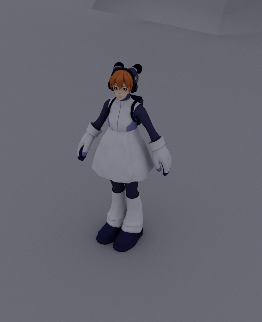


I used a combination of different renders, but I stuck with arnold for many of them, I did some renders with different with lighting - As her design is very purple I kept the theme with a fluorescent magenta.
I did make very simple scene for the video, as she is a mecca themed character I put her in a space setting.
Video Link - https://www.youtube.com/watch?v=PthJ3pbTMPY

Comments
Post a Comment