Professional Sequential Practice
Professional Sequential Practice
Live Project:
For this live project we are working in teams of 4-5, we each have to produce a pitch individually.
The company that we are working with this time is Provide (Community Interest Company), the section of the company we are producing an animation for is 'Provide Wellbeing: ASD Referall Service'. Our job is to make a 3-40 second ad that conveys the core values of the company.
Mood Board -
Pitch -
In my pitch I wanted it to be clear that the focus of the advert would be to highlight the benefits the company provides to the ASD community as well as giving an emotional link/character for audiences to relate to, the character starts as a young girl, which viewers at the same age can see themselves in, then she grows into an adult, parents/adults with ASD can relate and finally, she has a child of her own, which parents watching can relate to if looking into ASD for their own children.
Concept Art -

In the concept art I created for this project I wanted to stick with a clean and simple art-style with a minimal colour palette (Using colours outlined by the Provide Wellbeing Guidelines we were given to refer to). The main character of the advert is going to transition from her room to a void, since I was avoiding detail I used colour to make the change in scene clear - The dark blue of her room to the vibrant pink provides enough of a contrast and tone for the story.
Video Link - https://youtu.be/0fQsO3Bg_68?si=ArKpAG6a9CBU2rSD
Enma's Pitch -
Backgrounds -
The role I was given was background artist, I did all of the backgrounds for the advert - Working with the colour palette Enma had chosen was vast but cohesive so putting the backgrounds together was made easier. I used the digital pen that Enma had exported to everyone on the team, so all of the line-work would stay consistent.

For the shots of the playgroup in the introduction of the advert we agreed on using a lot of colours to show how the environment could be overstimulating, but the colour palette we used was cohesive enough that viewers shouldn't struggle watching. I did try to keep the backgrounds from being too detailed to have the characters stand out, but for these shots, the crowded-ness helps to convey how the character doesn't feel like they fit in.

In the shots above, the colour palette was changed to include mostly green to show the change of location better, although most of the background is later covered up by the sofa and parents, I aimed to include details that made it clear it was a home.

For the final shots of the advert, we wanted to have the background slide to the next one, so I had to make the dimensions 1080x3840 instead of the standard 1080x1920. These shot mainly included blue, as it was the conclusion of the advert with the characters receiving help, a calm colour was suitable and provided contrast to the earlier busier scenes.
Animation -
Although my main role in this project was background artist I still did some animation for the advert, as seen below.
Video link -
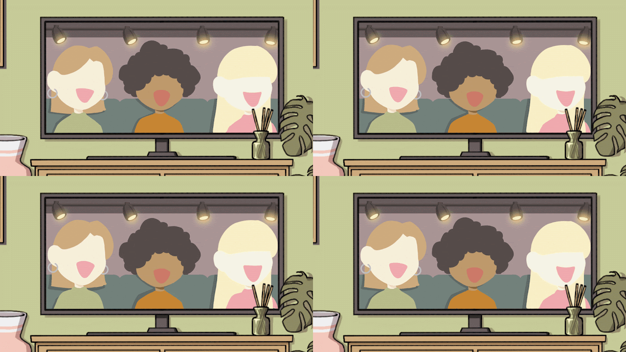
This shot I animated the contents of the TV with a lineless style for aesthetic purposes, but also so the shot wouldn't get muddied with too much action as the girl walks into the room.
I was asked to animate a head turn for the girl as she looks up frantically at all of the overstimulating elements in the room, I added a very small secondary animation of her hair whipping as she turns. The clock whirring and lamp flicker was simple, I had to layer the hands of the clock outside of the animation software as they were travelling at different fps, whereas the lamp was just a still image with a yellow overlay added every so couple of frames to imitate flickering.
Final Animation -
Video link - https://youtu.be/LbE-bGrfvZ8?si=wIm2xAM5kYnbn9ZA
The final animation came together quite nicely with everyones collaboration, we managed to keep the style and colours consistent. Everyone was communicative and willing for feedback on all of their work, we all did some minor things outside of our roles such as searching for sound effects, recording ourselves for voice-lines and compositing.


Comments
Post a Comment